Open Admissions
Led the redesign of an outdated admissions experience into an intuitive workflow hub, reducing task time by 30% and delivering an industry leading NPS score of 35.
Company
Role
Year
DaVita
Design Lead
2022 - 2023


The Challenge
An outdated interface slowing patient care
The Open Admissions Smartapp (OAS) was initially intended to feed data into clinical workflows, leaving the user interface disconnected from real-world workflows. The tool forced Integrated Kidney Care Assistants (IKCAs), who support Registered Nurses (RNs) in patient outreach, into inefficient workflows.
Rather than empowering IKCAs to easily prioritize & contact patients, the interface concealed critical information. The result was a greater degree of friction, slower outreach, and less time spent on providing patient care.
"I can't organize calls because patient list has no logic. "
"It takes half a day to complete my contacts & make updates."
"There are far too many clicks to complete simple tasks."
Outdated Interface
Users couldn't sort patients by admission type, making it difficult to organize and prioritize their workload for each day.
Workflow Inefficiency
The system didn't surface higher priority patients, forcing users to "hunt" through records to identify who needed attention first.
Time Constraints
Completing simple daily tasks required a multi-step process, often preventing users from finishing their assigned work on time.
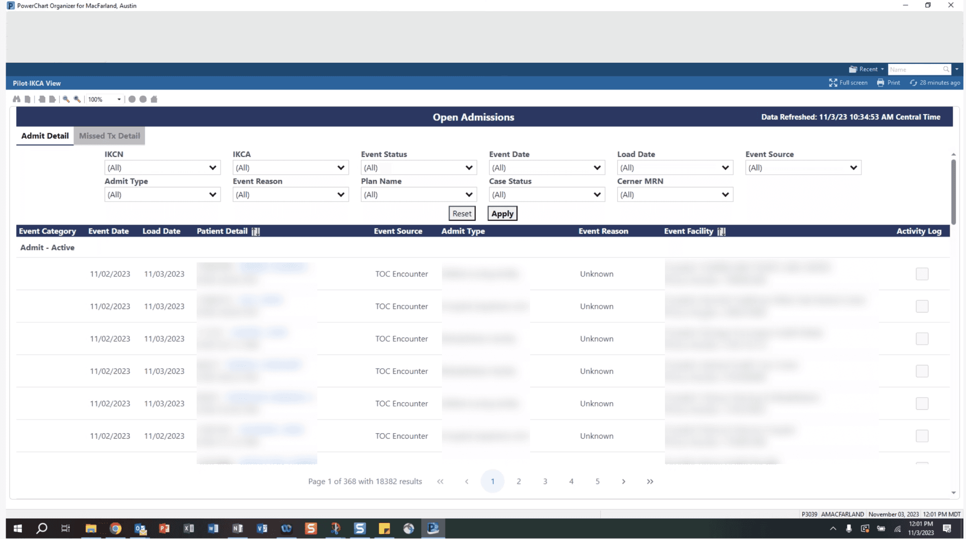
Existing Open Admissions App - Patient Data Not Available for Privacy Reasons
The First Designer
Building trust & leveraging user insight
When I joined the project, the team that had never previously worked with a designer. Clearly, the initial step was to build trust on the journey to driving meaningful change for our users.
After establishing trust via 1:1 meetings, we had a shared understanding of how we might approach user challenges, I conducted a holistic UX audit of the existing OAS interface. My goal was to find where friction thrived by identifying gaps between the interface and real world workflows, then map a path to clarity.
Audit findings
- Organizing patient populations: viewing patients by admission type allows for intuitive outreach priorities
- Clearer critical path: standardize CTA buttons to guide users effortlessly through important tasks
- Simplified filtering: reducing complexity & introduce new tools like 'Reset' and an 'Overdue' toggle
- Time to value: enabling users to complete critical updates directly in the UI
Centering the user experience
As I conducted the audit, I explored further into the primary workflow to develop an understanding that proved crucial in designing an experience that supported the IKCAs.
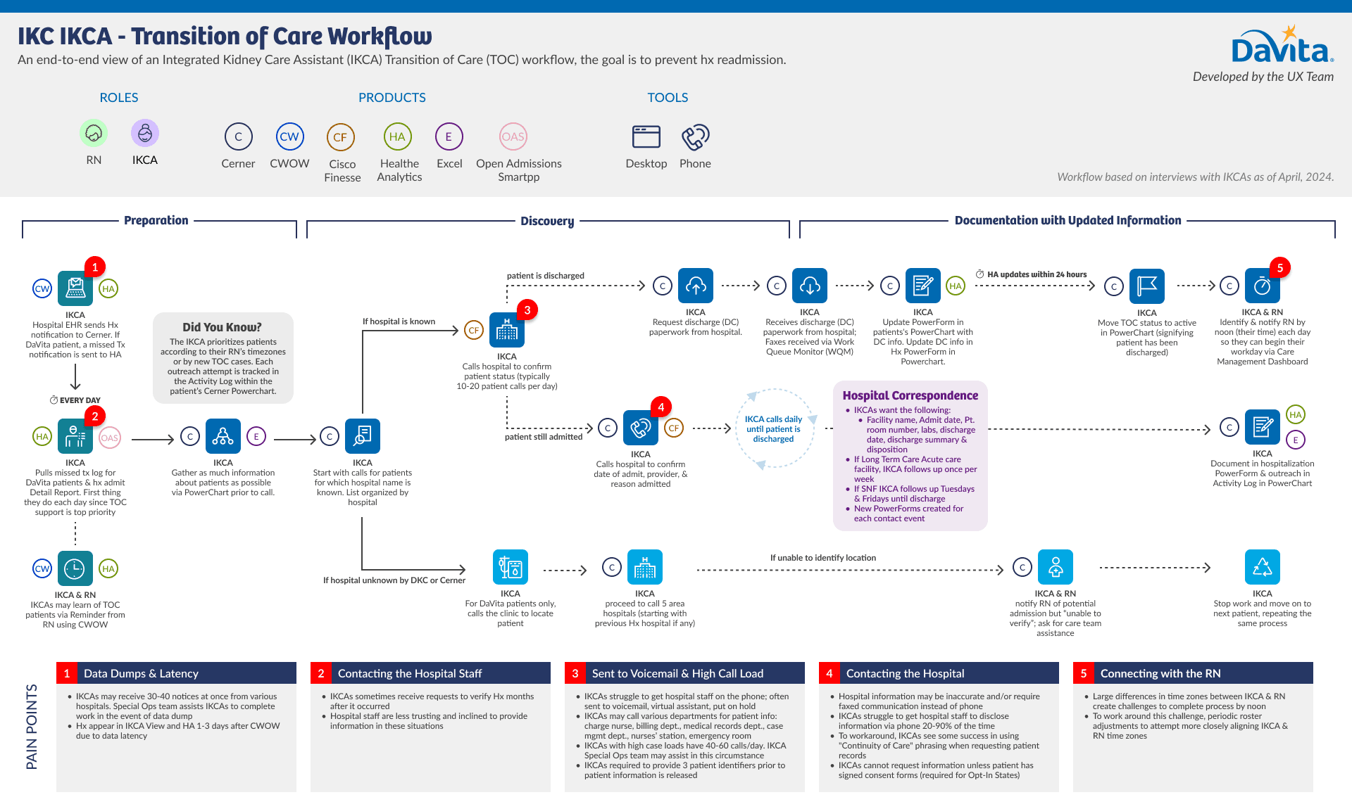
Workflow Map
Open Admissions Smartapp 2.0
A streamlined, intuitive experience
The redesigned OAS balanced familiarity with innovation, as we preserved core structural elements to minimize the learning curve while introducing targeted, high value improvements that made everyday tasks intuitive. We focused on surfacing critical patient information, simplifying navigation, and embedding key actions directly into workflows.
Patient Focused Navigation
Previously buried within tables, admission types are now primary navigation elements, allowing IKCAs to prioritize their outreach.
Unified Style
Created a unified style for all of the components within the interface—including filters, buttons, and various type requirements in the table.
Direct Action
The split button enables users to update the activity log without leaving the page & it supports secondary actions for future innovation.
Solution Quickview
Results
The redesigned Open Admissions Smartapp launched in 2024 to a very positive reception amongst our user base.
35
NPS Score (industry standard is 0)
"My day starts off so much more organized. I love that my front page pops up and has my TOC calls and new admits already sorted for me. The search options let me breakdown my morning workflow in a way that works best for me, so there is no chaos."
"I love the addition of the Admit tab - I feel more organized each morning which makes my calls go smoother and quicker. The Activity Log button has been a huge timesaver when tracking my existing TOCs."
More Case Studies & Writing
Patient Care Summary
Empowering Registered Nurses to deliver better care—reducing clicks by 85% & transforming data into a clear story.

AI Practices
I use AI to explore, build, and learn. It's an extension of my thinking that accelerates conceptual work, moving from theory to reality without sacrificing quality.

Modernizing OneView App
Repositioning OneView's mobile app to a trusted clinical companion—leading a redesign & a 40+ point NPS increase.