Guided Assessments
Led a cross functional redesign of a post hospitalization tool, delivering a clinician centered workflow that streamlined care delivery and drove a 110-point NPS turnaround.
Company
Role
Year
DaVita
Design Lead
2024 - 2025


The Challenge
A tool that created more problems than it solved
In 2024, DaVita launched Care Pathways, an EHR-native application intended to help Registered Nurses (RNs) provide relevant follow-up actions after a patient's hospitalization.
The idea of guiding clinical outreach to reduce repeat hospital visits was sound, but the app caused more delays than intended.
"Is this a tool or a threat?"
"The charting expectation across Cerner is unhinged."
"It feels like they are babysitting us."
Bloated Input Volume
The application required RNs to input far too much information even for quick phone calls—over 70 fields led to clinician burnout.
Disorganized Clinical Flow
Because the clinical workflow wasn't created with the user in mind, RNs were forced to skip around the application while intaking patient data.
Free Text Overreliance
The application forced RNs to "write a story" about their phone call, while free text areas didn't correlate to a real world experience.
The Design Approach
From EHR-native to the Smartapp ecosystem
Alongside my product & technical partners, we proposed to rebuild Care Pathways as a standalone SMART on FHIR application, removing it from Oracle Cerner's constraints while integrating it into our growing suite of connected clinical tools.
Discovery process used to align product, design, and engineering
Step 1
Audit
Evaluated workflows to identify friction & redundancy
Step 2
Backlog Review
Cross referenced insights with active product priorities
Step 3
Impact Matrix
Prioritized opportunities with engineering
Step 4
How Might We
Synthesized insights into aligned problem statements
Step 5
Wireframes
Translated direction into early workflows for team review
Usability Audit
Pathway Landing Page
- Lack of one click entry to open a Pathway from the 'Available Pathways' section
- Inability to edit completed Pathways & unclear usage of Suggested Pathways
- Disconnect from hospitalization data, which helps drive completion

Application Page
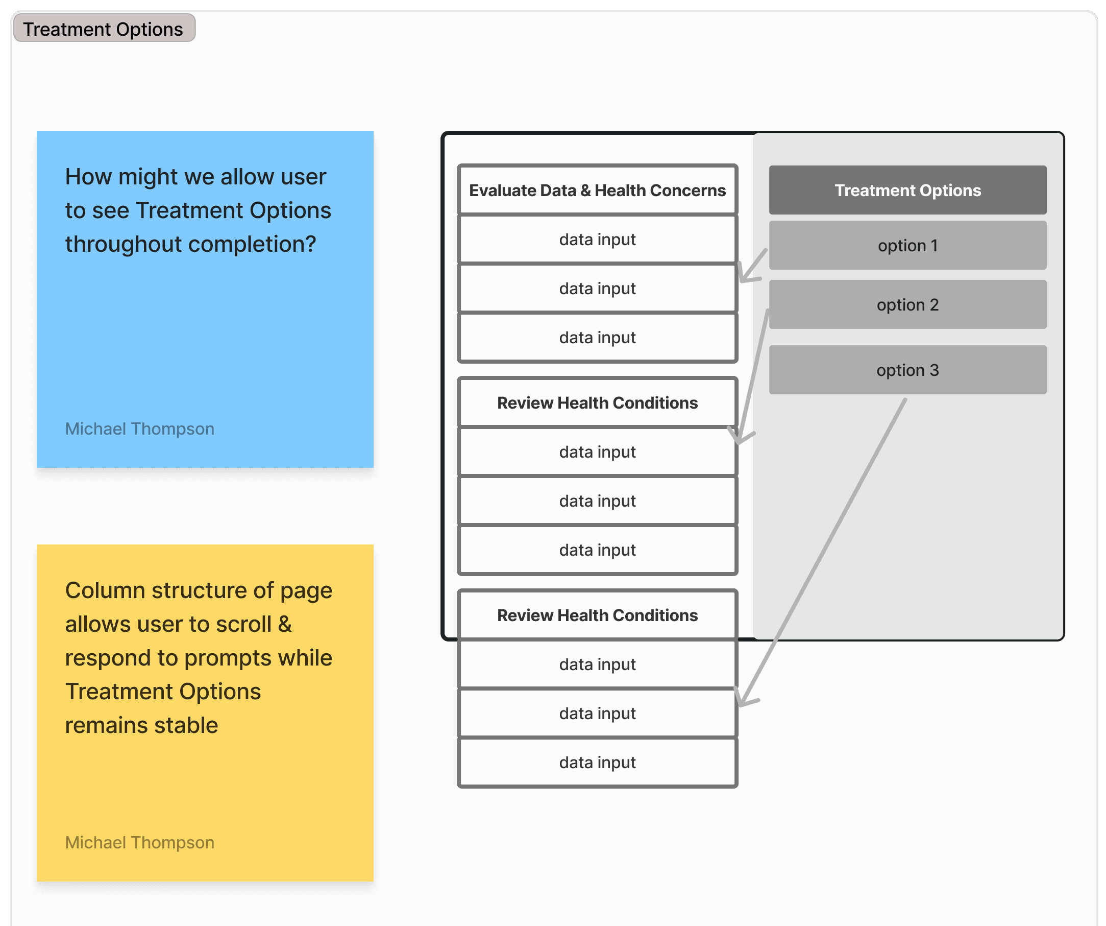
- No obvious connection between input (left column) and user action (right column)
- Lack of decision hierarchy for user actions connected to patient treatment
- Inclusion of dead link (Show All Treatment Options) across app

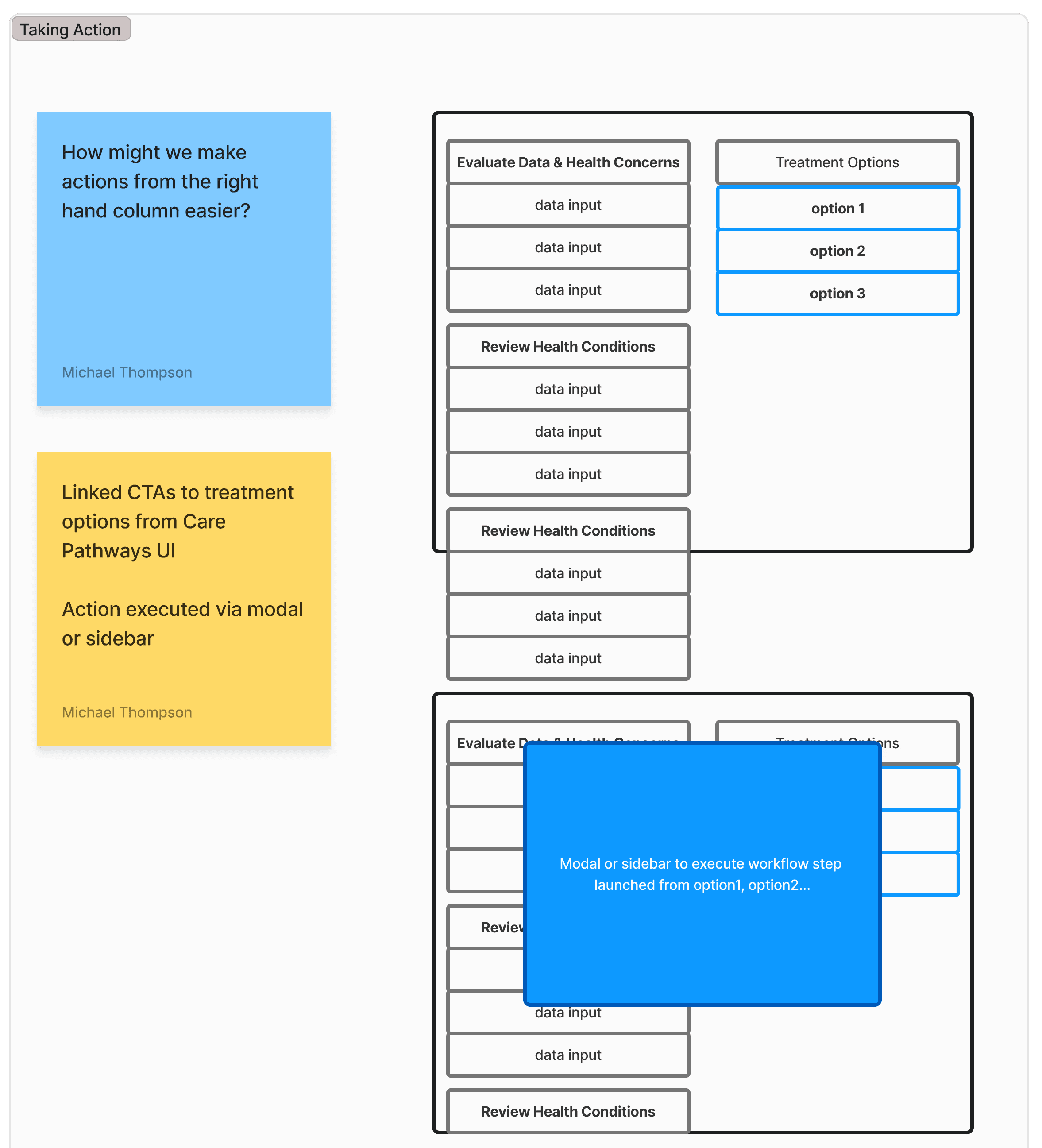
Workflow
- User forced to scroll up to recall Treatment Options (recommended actions)
- Inability to save work while completing form lead to wasted time
- Lack of visibility into entirety of input section in progress

Completion Process
- Unclear Pathway status once the input & output data is complete
- Inaccurate call to action description for Active Pathways
- Treatment Options locked inside Pathway once Completion is clicked

Impact Matrix
I created an impact matrix to create the design roadmap for the project. To ensure the roadmap was solidified and the impact-effort dynamic was accurate, I collaborated with engineering to co-create the early stages of the application.

Impact matrix prioritizes opportunities with engineering.
How Might We & Wireframes
To synthesize insights, I created How Might We statements for major issues the team identified. Then, I used quick tools in Figjam to create lightweight wireframes as the design framework came to life.
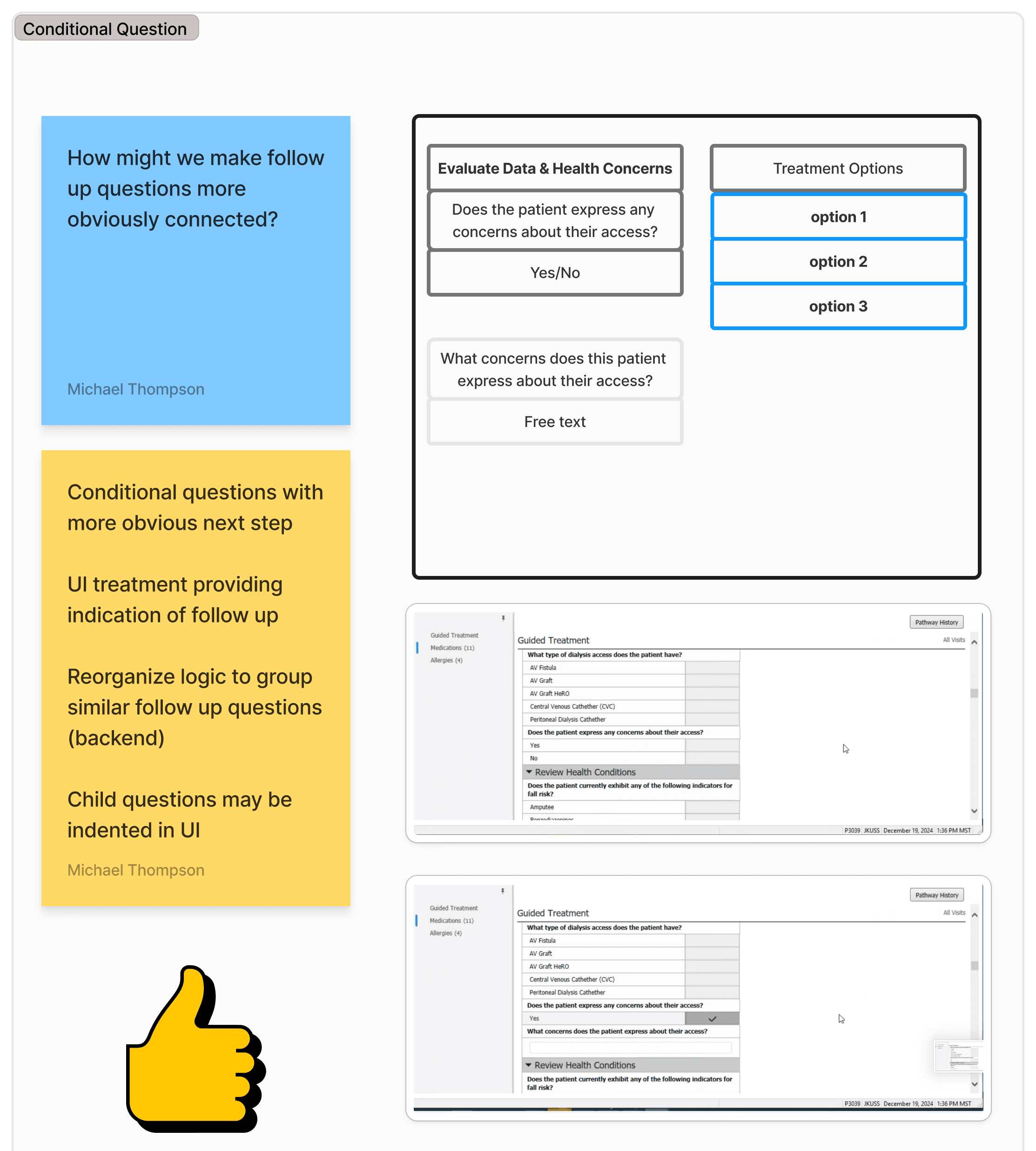
How Might We questions & wireframes synthesize insight while aligning collaborators.
Designing the Solution
A more focused experience
From sketches to high fidelity UI, I led the full end-to-end design effort. The primary challenge was balancing clinical nuance with intuitive usability. Every element was designed with clarity in consideration of the clinical context.
Modular Workflows
- Reduced noise & surfaced only what's relevant to each patient
- Greater clinical customization across any role using the application
- Easily view all relevant actions the clinical user can take on behalf of the patient
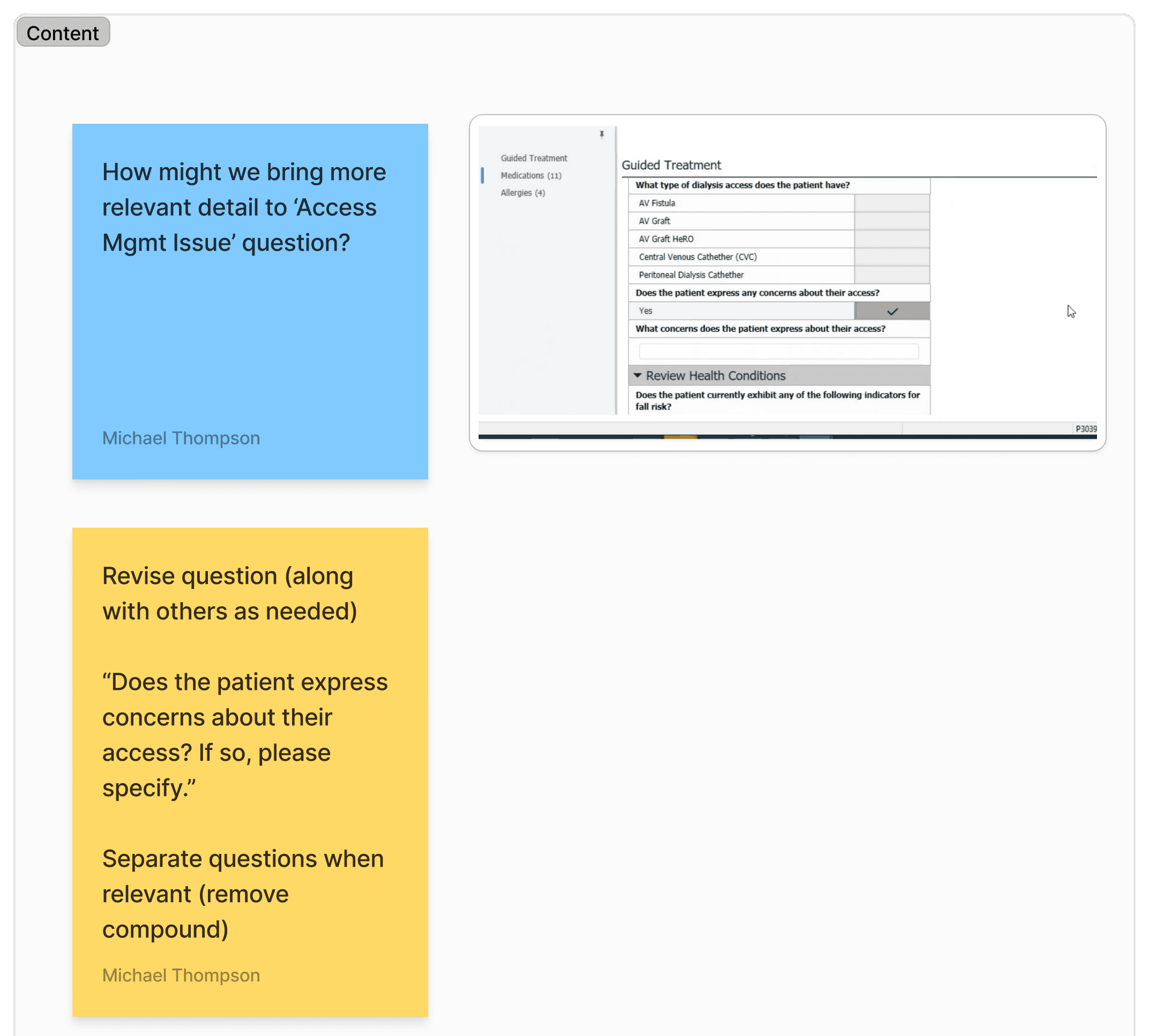
Smarter Inputs
- Replaced long, narrative-driven text fields with guided select and multi-select inputs
- Leveraged UX research to understand what's most important to clinicians
- Progress and completion indicators enable seamless scanning with data-dense interfaces
Custom Components & Prototype
I designed a custom component built for the app's unique needs, expanding beyond our standard design system. Throughout the process, I leveraged prototyping capabilities to communicate design decisions & intent to stakeholders.


Solution Quickview
Results
The Guided Assessment Application launched in Q4 2025. With a total total investment above $1 million, it's a direct reflection of the strategic value this tool holds for the business. Alongside an unprecedented turnaround in NPS, the completion rate witnessed a massive increase—from about 30% to 96%. Together, these metrics highlight the effectiveness of aligning the platform around connected care.
+110
Point turnaround in NPS score
"Very user friendly & definitely easier on the eyes than the other model. With the radio buttons, it makes everything much easier."
"There are many features I'm happy about, nice that it shows progress. This is great for established & new nurses."

Open Admissions
Reimagining an inefficient interface to an intuitive workflow hub. Reduced task time by 30% & seeing an NPS score of 35.

AI Practices
I use AI to explore, build, and learn. It's an extension of my thinking that accelerates conceptual work, moving from theory to reality without sacrificing quality.

Modernizing OneView App
Repositioning OneView's mobile app to a trusted clinical companion—leading a redesign & a 40+ point NPS increase.